Flickr Realign
July 8, 2010 -In 2005 the esteemed designer Cameron Moll wrote the famous Good Designers Redesign, Great Designers Realign for A List Apart.
His premise is simple; rather than ditching a design and starting over every few years, make tweaks and slowly evolve the site using relevant analytics data and user testing. The obvious advantages include maintaining a working relationship with your client and making a less jarring experience for the audience.
A Flickr Realign
Even though I’m a total Google Fan-boy; I think Yahoo’s Flickr property does a pretty amazing job at delivering a great product in a fun way. When confronted with user complaints over some down-time issue, Flickr responded with a post called “Sometimes We Suck.” Very engaging!
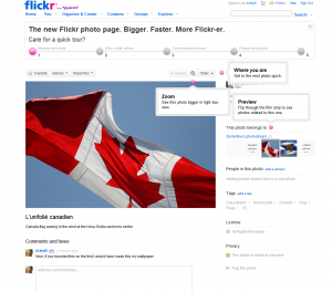
Recently they did a realign on their photos page. The tweaks changed some of the tools around the photo; the way you view it, who did it, geolocation and other little details. Rather than simply getting viewers to try to re-learn the new UI, they introduced it with this nice tool bar:
When you rollover the 5 key points divs jump up to point out the difference and offer an explanation.
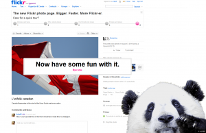
And finally when you get to the last point, this happy looking character animates into site to offer his best wishes:
No one likes change, website regulars are often the epitome of this. Rather than let users flounder or stumble over new UI; Flickr explicitly shows you what’s different and why. Flickr not only pulled off a tasteful realign; they did it with panache.
Categorized in: Personal
This post was written by ArleyM


